

TAC Branding
Overview
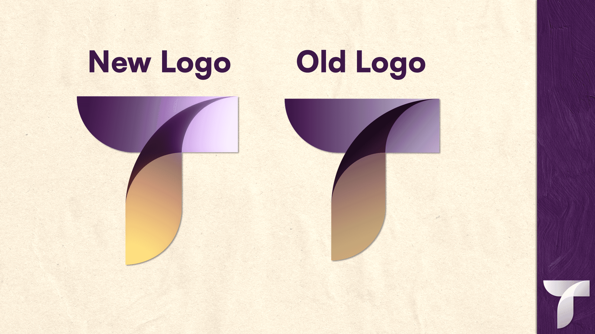
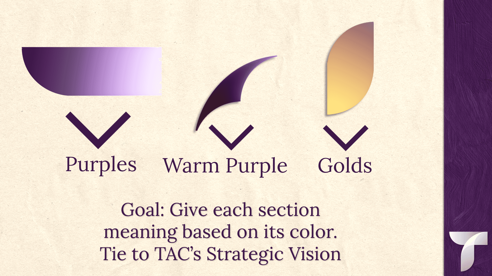
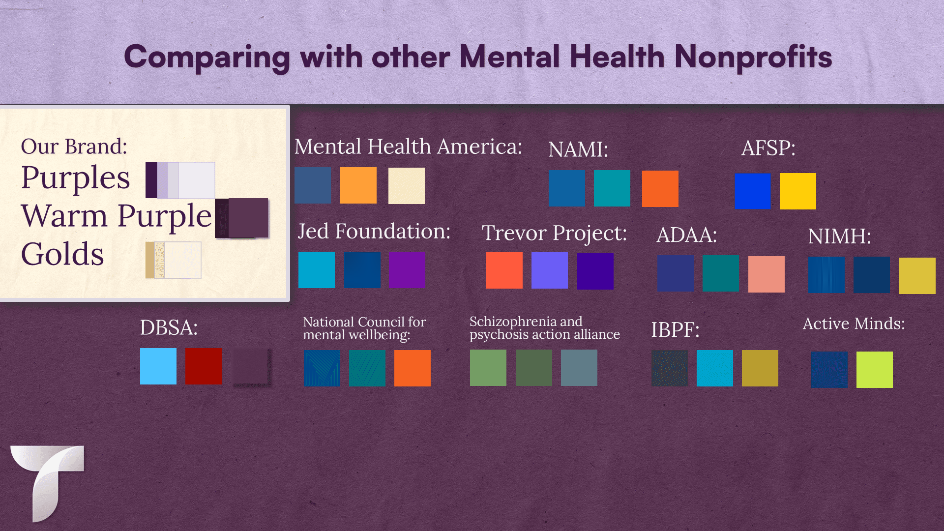
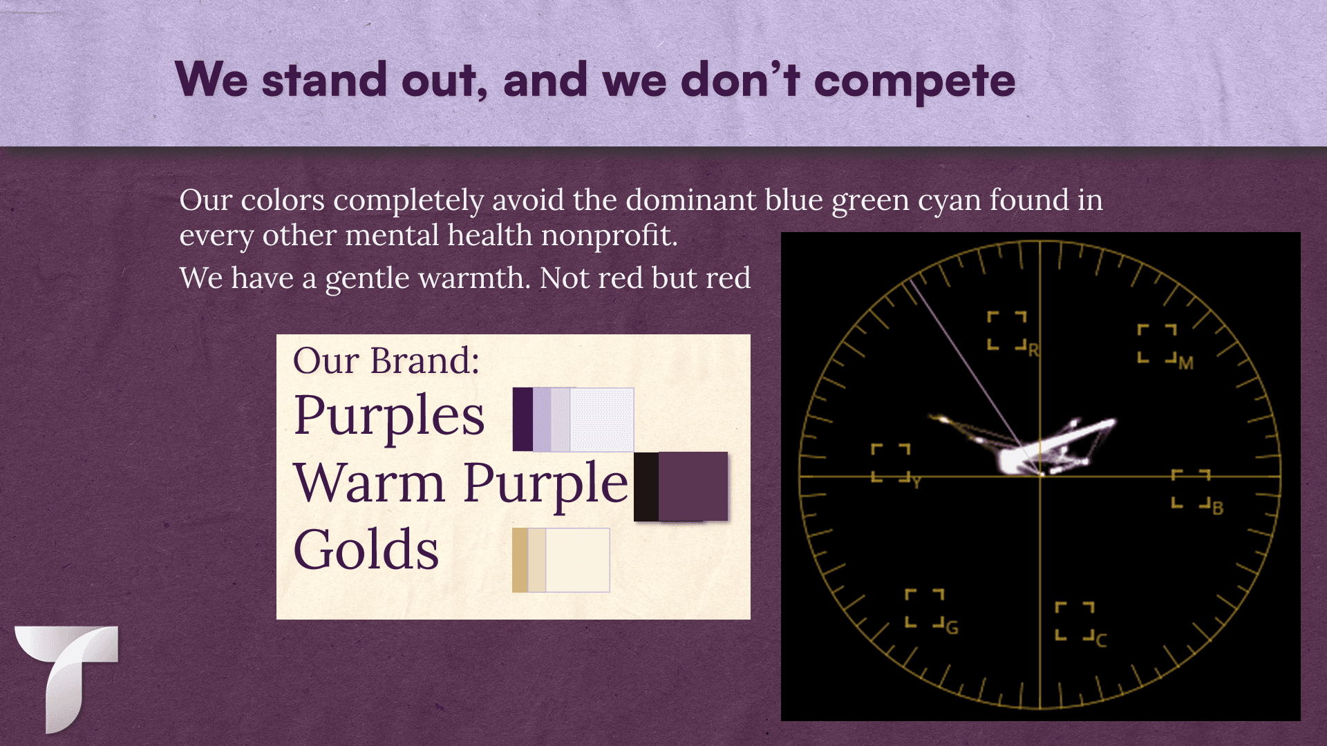
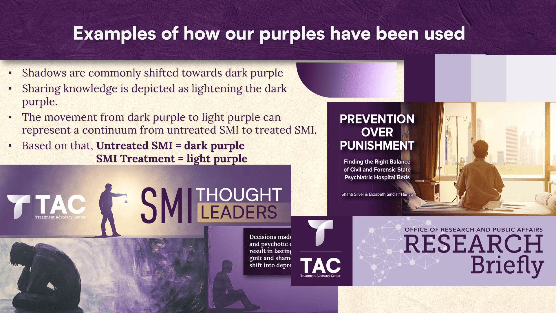
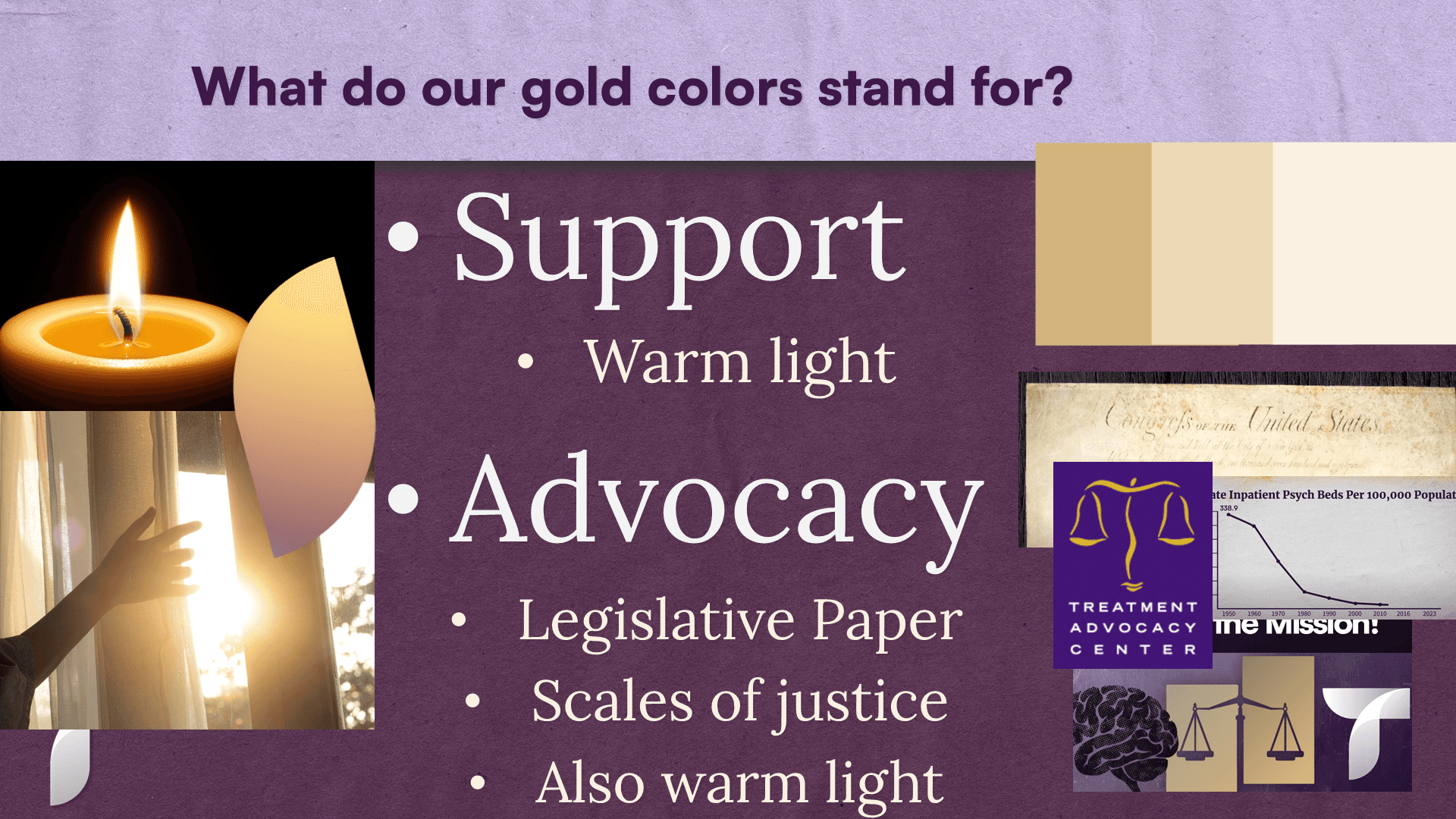
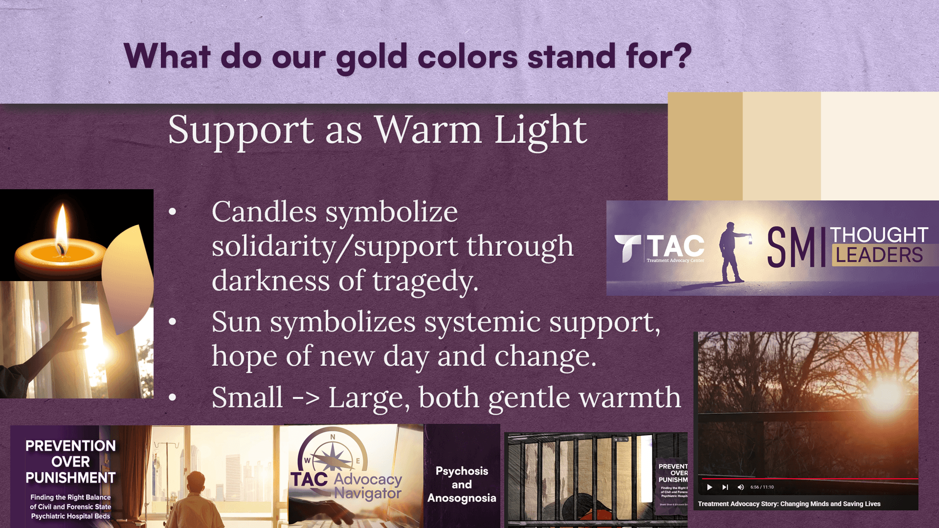
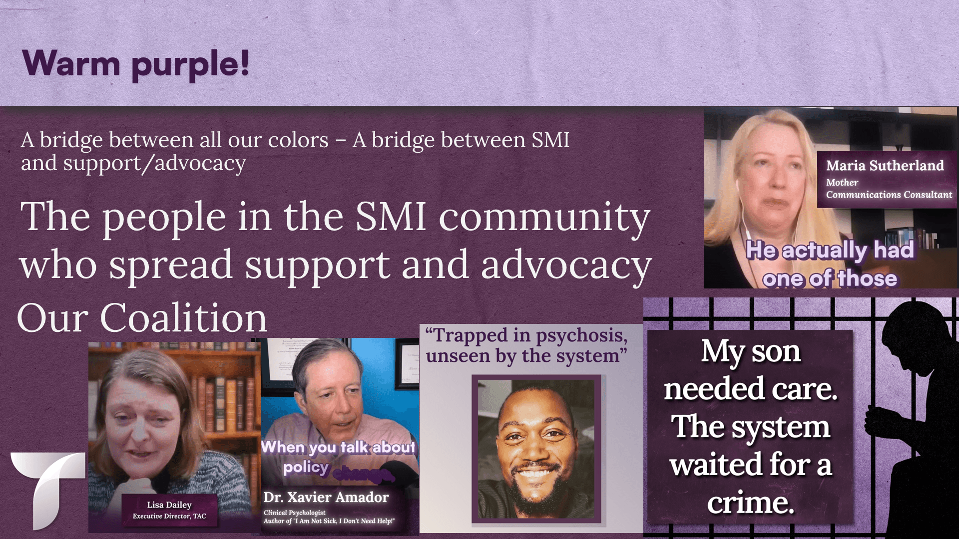
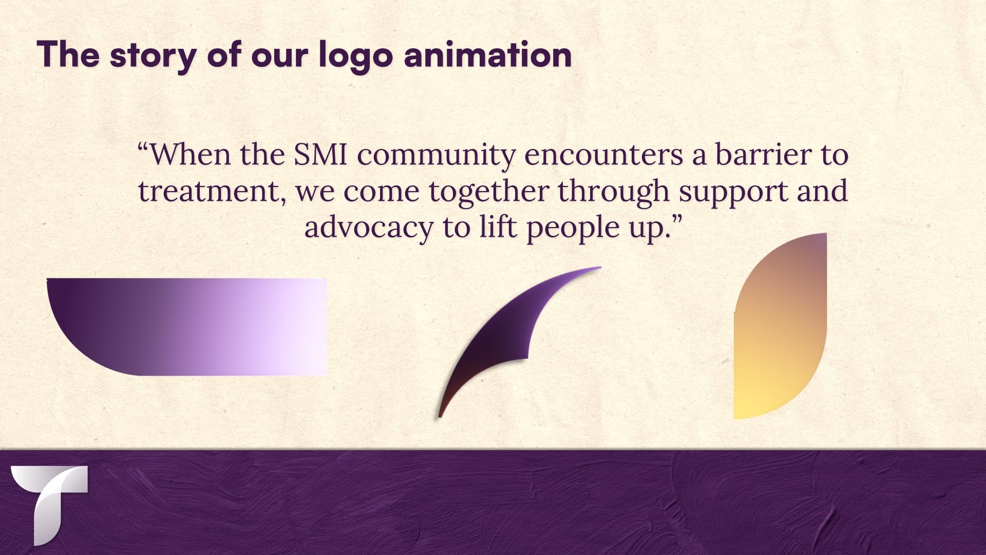
When I joined Treatment Advocacy Center, the organization lacked a cohesive visual identity and its social media presence looked inconsistent and unpolished. Over my three years there, I rebuilt that identity from the ground up and raised the bar for every piece of content tied to the organization's name. I redesigned TAC's logo and created a logo animation whose motion and symbolism were built around the organization's strategic plan and mission. I also assigned intentional meaning to each color in the new brand palette, so the visual identity carried symbolism beyond aesthetics. I iterated and tested variations on the brand's visual style over three years, using social media performance metrics to guide what stuck. In the end, the style that performed best combined photographic imagery shifted into our branded color palette with layered, complex compositing.
Scope of work
- Creative Direction
- Art Direction
- Motion Design
- Graphic Design
- Web Design
- Marketing Manager